

On my desk are two books to help improve my writing by writing fewer words, better. It takes me 1,000 words to say anything on this blog. I don’t have that kind of time and neither does anyone else. My academic training whispers about APA format, methodology, and conclusions.
Hey, whisper! Blogs aren’t journal articles. Back off, you’re getting in my way!
Anyway…
I love data visualization. We should all strive to make reports more beautiful and meaningful by creating thoughtful images to tell a story. The American Evaluation Association has some of the best resources and people to help do this.
Sometimes, in our quest to make our work professional and impressive, we remove all the joy and wonder. This is not good.
The last 18 months of my working world focused on designing and implementing the ten-year evaluation of our program. My colleagues and I experienced the full gamut of what makes evaluation worthwhile and worrisome. We could write a book about embracing favorite fears, dancing with doubts, and bearing witness to the parade of passions that create and sustain programs. It wasn’t easy and we wouldn’t have had it any other way.
Today is Watercolor Wednesday, so I’m sharing a bit of “art” from this evaluation project. I can share the art because it’s mine and I didn’t produce it on company time.
Our project needed an image to represent what we learned that our audience would relate to. Common challenge.
The inspiration image was a group concept map. These things look a bit like a screen capture from the Atari game Asteroids, but have lots of serious data behind them. In a meeting someone said our map had a “hub and spoke” look to it. You can find out more about concept mapping here, here and here (in increasing level of detail). We wound up with a conceptual model that looked like this:

No one is going to be put-off by this as a model. It relates to the data it represents (you’ll have to trust me on that). We can go around the model and talk about each concept in the report or a presentation. The color scheme can be applied to more detailed representations of the data. (Note: We did NOT use the default color scheme in for our report!) It pleased everyone.
However, the model left me unsatisfied. The time, wisdom, experiences, thoughts and work of almost 500 people went into this project.
Where is the complexity? Where is the depth? Where is the brilliance?
I needed a way to express the journey. My journey with the program, our journey as a team, the journeys of people touched by the program in the last 10 years- all of it. I painted this:
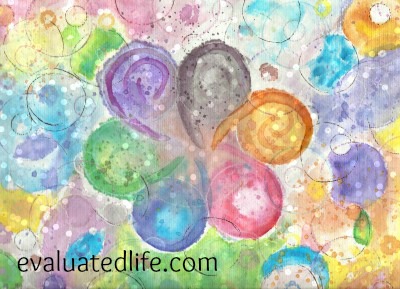
The conceptual model (appropriately labelled) is on the front cover of the report. The center swirly bit of the painting graces the back cover.
I think that’s kind of cool.
I like this little painting. It reminds me of what drew me to evaluation generally and this program specifically. We like to isolate variables, control for error, and put things in neat boxes. This is worthwhile and has it’s place. But, it is simply not how life works. Life is interconnected, messy, vibrant, unpredictable and glorious. Programs and organizations and people are, too.
The charts in the report follow wise data viz advice.
This little painting breaks all the rules.
It’s important that I find a way to value both.
